Twitter Profile Picture Size: The Complete 2026 Guide
X recommends a 400 × 400 pixel profile photo at a 1:1 aspect ratio, with a 2 MB maximum file size, and it displays that upload as a circle. That’s the right starting point, but it’s only the starting point, because the same avatar has to survive feeds, notifications, search, and profile pages without losing recognition.
Discovering the hard part often happens only after the upload looks fine in the editor and then turns muddy, clipped, or too busy once it’s live. If you’re trying to make a headshot, a logo, or a mascot work on X, the key question isn’t just what the upload spec is, it’s what stays legible after the platform shrinks and masks it.
Table of Contents
- The Official Twitter Profile Picture Size in 2026
- Where the 400 Pixel Upload Actually Shows Up
- Cropping for the Circular Mask
- PNG, JPEG, or GIF for X Avatars
- Quick Reference Specs for Every Profile Asset
- Why Designing for the Smallest Display Wins
- Troubleshooting Upload and Quality Problems
- Running an A/B Test on Your Profile Picture with Birdy
- Measuring Followers, Clicks, and What Each Metric Proves
- A Practical Pre-Upload Checklist and the Road Ahead
The Official Twitter Profile Picture Size in 2026
The official twitter profile picture size is still 400 × 400 pixels at a 1:1 square ratio, with a 2 MB maximum file size, and X accepts PNG, JPEG, and GIF uploads according to its help documentation. X’s own help page is the baseline to trust for export checks and upload limits. X’s profile photo help documentation spells out the rules directly.
That spec has stayed fairly stable through the Twitter-to-X transition. Independent design references note that the core 400 × 400 recommendation survived the rebrand, and even the hexagonal NFT-connected profile photo option was later discontinued, so the avatar is back to circular presentation. Linearity’s X size guide captures that history clearly.
A file can meet the spec and still look weak once X crops it.
The test is whether the image survives being downscaled, masked into a circle, and shown in different on-screen contexts. A face with too much empty space, a logo with thin strokes, or a branded illustration with small text can all pass upload and fail in practice. The official spec covers dimensions and file type, but it does not tell you whether the subject stays readable after the platform trims the edges.
Practical rule: if your file meets the X spec but still looks weak, the problem usually isn’t the upload size. It’s the crop, the subject placement, or the fact that the image was built for a large preview instead of a tiny avatar.
If you need to prep a file quickly, a best Twitter image resizer can save time, especially when you are starting from a headshot, logo, or branded illustration and need to force it into a clean square before uploading. The important part is still the same. Get the square right first, then judge whether the design holds up once X turns it into a circle.
Where the 400 Pixel Upload Actually Shows Up
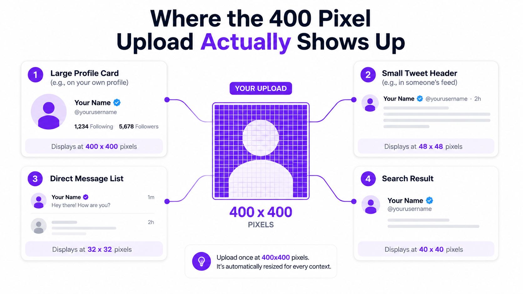
The useful part of X’s avatar spec is not the upload size itself, it’s where that image ends up on screen. A profile picture that starts as 400 × 400 can appear much smaller in the product, which is why a detailed logo or a text-heavy mark often fails even though it technically fits. Independent guides report examples such as about 48 px in the timeline, 64 px in notifications, and 134 px on a full profile page, while other references describe roughly 200 × 200 on profile, 48 × 48 in feeds, and 32 × 32 in notifications. That spread explains why the same image can feel sharp in one place and mushy in another. TweetArchivist’s profile image guide calls out the practical mismatch between upload and display, and Social.kit’s X profile picture sizing guide reiterates the circular display behavior.
The main display contexts
A full profile page gives you the biggest read, so a face or logo can still feel recognizable there. The feed is stricter, because the avatar sits beside dense text, multiple actions, and competing thumbnails. Notifications and in-thread mentions are the harshest test, since the image has almost no room to carry detail.
The link between those contexts is simple. The image is not being judged as artwork, it’s being judged as an identifier.
Design for the smallest reliable view, not the biggest possible one. If the avatar still works when it’s tiny, it will usually feel strong everywhere else.
That’s the reason text inside an avatar so often fails. Thin lettering disappears first, edge detail gets swallowed by the circular mask, and intricate illustrations blur together before the eye has time to parse them. The safest move is to simplify the composition until the subject reads instantly.
The practical takeaway
If you’re choosing between a busy logo and a plain portrait, the plain portrait often wins for recognition. If you’re choosing between a detailed mascot and a simplified mark, the simplified mark usually survives better in the feed. The avatar has to earn attention at the size where people first notice it, not only at the upload size.
You can also map this directly against your own profile design workflow with the Birdy extras guide, since avatar testing becomes more useful when you look at the whole profile surface instead of the picture in isolation.
Cropping for the Circular Mask
X displays profile pictures as circles, so the corners of the square upload are effectively dead space. That sounds obvious, but it’s where a lot of good source art gets ruined. A logo that looks balanced in a square can lose its outer marks, and a headshot with too much headroom can feel oddly detached once the crop lands.
What belongs in the center
Put the face, the primary logo shape, or the main illustrated character in the middle of the square. Leave breathing room around the subject so the circle can trim the edges without cutting into something meaningful. For a person, the eyes should usually sit high enough in frame to read quickly but low enough that the top of the head isn’t jammed against the edge.
For brand accounts, the safest version is often the simplest. A compact wordmark, a symbol with strong silhouette, or a single mascot head will survive better than a wide logo lockup with small text attached.
What gets cut first
Anything near the corners is vulnerable. Small copy, fine outlines, and decorative flourishes disappear first when the mask is applied. A badge, sticker, or background pattern that touches the edge might look polished in design software and still become visual noise inside the avatar.
The easiest test is to step back and ask whether the image would still make sense if the outer square vanished. If the answer is no, the crop needs more padding or a simpler subject.
Keep the safe zone generous. If you have to debate whether something is too close to the edge, it probably is.
That’s also why rapid testing matters more than polishing one export forever. The crop can be technically correct and still underperform in recognition, which is the metric that matters for a profile photo. A profile picture is doing branding work in a tiny circle, not hanging in a gallery.
For a deeper workflow on composition choices, the Birdy profile picture guide is a useful reference point because it keeps the focus on subject placement rather than abstract design theory.
PNG, JPEG, or GIF for X Avatars
Format choice matters because X accepts more than one kind of avatar file, but each format serves a different job. The right answer depends on what the image is trying to do. A logo, a portrait, and an animated avatar all need different exports even if they start from the same source file.
PNG for graphics and sharp edges
Use PNG when the avatar includes logos, illustrations, transparency, or any edge that needs to stay crisp. PNG tends to preserve clean boundaries better when the image gets reduced and masked. That makes it the safest default for brand marks and UI-style graphics.
JPEG for photographs
Use JPEG for headshots and other photographic images. It’s usually the better fit when the source is a portrait with skin tone gradients, natural lighting, and no transparent background. The file is often easier to manage for photo-based avatars, and the result is usually perfectly fine under X’s size cap.
GIF for animation
Use GIF only if you specifically want motion in the avatar and accept the trade-offs that come with it. Animated avatars are a niche choice, and they’re easiest to justify when movement is part of the brand identity rather than an afterthought.
Higher resolution beyond the platform’s recommended 400 × 400 doesn’t buy you meaningful display quality once X downscales the image. It can only make the file heavier. The smarter export is the one that stays clean at the size people see.
Quick Reference Specs for Every Profile Asset
Here’s the fast lookup version when you just need the numbers in one place.
| Spec | Value |
|---|---|
| Profile picture size | 400 × 400 pixels |
| Aspect ratio | 1:1 |
| Maximum file size | 2 MB |
| Accepted formats | PNG, JPEG, GIF |
| Display shape | Circle |
A few practical notes sit behind that table. The upload target is square, but the visible treatment is circular. The image should stay centered because the mask trims the edges. And if you’re handing the asset to a designer, keep the working file clean enough that it can be exported again without extra compression passes.
For the broader profile package, the related banner spec is often the next thing teams ask about. The Birdy banner guide is helpful if you’re aligning the avatar with the header rather than treating them as separate assets.
- Upload target: keep the file at 400 × 400.
- Shape: build for a square, then preview it as a circle.
- File cap: stay under 2 MB.
- Formats: choose PNG, JPEG, or GIF based on the content type.
- Composition: keep key elements centered so the crop doesn’t clip them.
Why Designing for the Smallest Display Wins
The strongest avatar is usually the one that works at the smallest size first. That sounds counterintuitive if you’re used to designing for high-resolution source files, but X does not reward microscopic detail once the image becomes a small circle beside a post or notification.
Recognition beats detail
A profile picture has one job before anything else, it has to be recognized fast. Fine texture, tiny lettering, and decorative edges help at full size, then vanish when the avatar is reduced. What survives is contrast, silhouette, and a subject that’s obvious at a glance.
That’s why a simplified face or logo often outperforms a crowded design. The reader doesn’t need to admire the illustration. They need to know whose account this is before their thumb keeps moving.
The design rule that actually matters
If the image still reads clearly when it’s tiny, it’s probably strong enough for the rest of X’s surfaces. If it only looks good at the upload size, it’s doing the wrong kind of work. The avatar is a recognition cue, not a poster.
Practical rule: strip away anything that doesn’t help identification in a small circle.
This also changes how you judge “quality.” More pixels don’t fix a weak composition. A cleaner subject, stronger contrast, and less edge dependence usually do more for performance than another export pass ever will.
Troubleshooting Upload and Quality Problems
When a profile picture looks wrong, the cause is usually one of a few repeat offenders. The good news is that each one has a simple fix if you diagnose it in order.
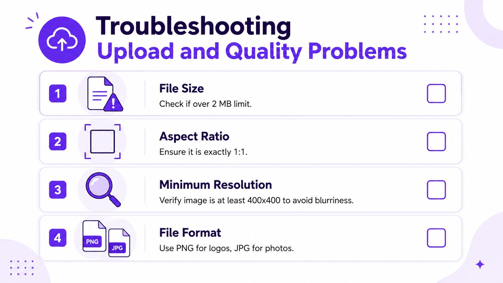
The usual failure points
- File too large. If the upload refuses to go through, check whether the file is over 2 MB. Compress or re-export it.
- Wrong shape. If the image feels stretched or off-center, make sure it’s exactly 1:1 before uploading.
- Too little source quality. If it looks soft after upload, start from a larger, cleaner original and avoid tiny source files.
- Wrong format. If the design has text or sharp edges, use PNG. If it’s a photo, use JPEG. If it’s animated, use GIF.
A blur that appears only after upload usually means the original file wasn’t strong enough for downscaling. A crop that looks fine in the editor but awkward in the timeline usually means the center wasn’t framed tightly enough. A profile picture that seems different on web and mobile is often just cache or device rendering, so give the app a little time before assuming the new file failed.
If the avatar looks acceptable in the upload dialog but weak everywhere else, don’t keep tweaking the same crop endlessly. Reframe the subject, simplify the composition, then re-upload. That gets you farther than trying to rescue a busy design with sharper export settings.
Running an A/B Test on Your Profile Picture with Birdy
Birdy rotates two profile versions through X’s API on a schedule, which makes avatar testing practical without manual flipping. For profile pictures, the right setup is straightforward. Keep both variants within the 400 × 400 spec, crop both for the circular mask, and test one change at a time so you know what moved the needle.
The workflow is built around switchback testing, which means visitors are grouped by time blocks instead of being randomized one by one. That matters on a social profile because the account itself changes at the profile level, not per visitor. Birdy then reports the outcome in a way that’s useful for growth work, not vanity design.
How to run the test
- Create two variants. Keep both versions valid under X’s upload rules and make the crop difference meaningful.
- Rotate them on a schedule. Birdy’s plan-based cadence alternates profile versions every two hours on Free and every hour on Pro.
- Hold the test long enough. Don’t stop after a quick glance. A switchback only helps when each version gets real exposure across multiple time blocks.
- Keep the rest of the profile stable. Don’t change the bio, banner, or display name mid-test unless you want to muddy the result.
Pinned tweets aren’t part of the testable surface, so avatar testing stays focused on the profile elements Birdy can rotate. That limitation is useful, because it keeps the comparison clean.
The main value of this approach is simple. You stop guessing which crop feels better and start comparing variants under the same operating conditions. The Birdy optimization workflow fits this kind of profile-level testing well because it treats the avatar as one variable inside a larger conversion system.
Measuring Followers, Clicks, and What Each Metric Proves
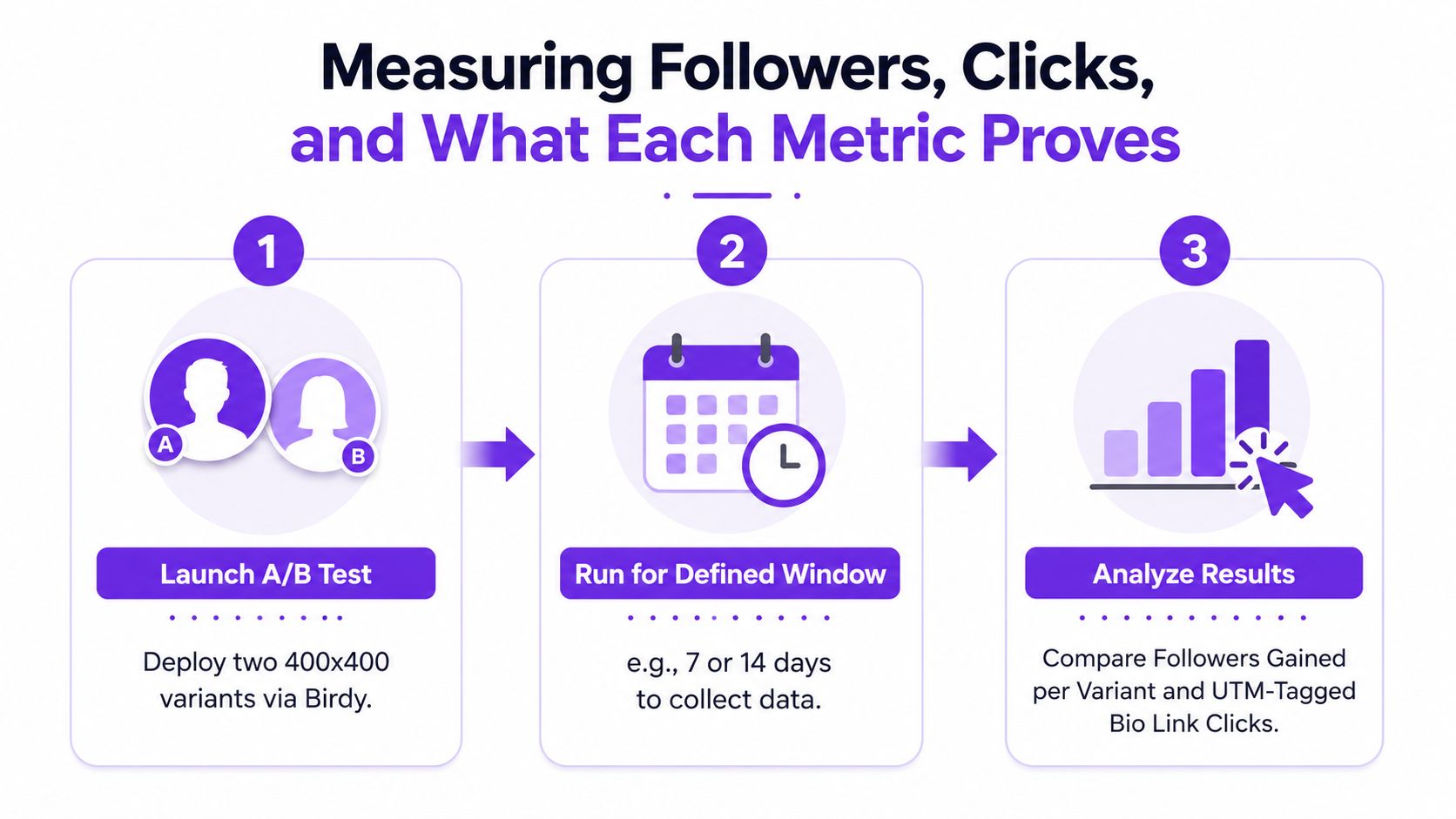
Birdy’s reporting is useful because it separates the two outcomes people care about most on a profile. One is whether a version earns more followers. The other is whether the profile as a whole drives more website clicks through the bio link when the link is tagged correctly. Those are related, but they’re not the same thing.
Followers per version
Followers gained per version is the cleanest signal for avatar performance. It tells you which profile picture earned more follows within the same test window. That’s the metric to trust when you want to know whether one image is more recognizable, more credible, or easier to parse at a glance.
UTM-tagged bio clicks
UTM-tagged bio link clicks tell a different story. They show whether the profile page itself converts better during one variant or the other, but the picture is only part of that path. The name, bio, and link all influence the click decision, so treat this as a profile-level measure rather than a pure avatar score.
A follower win with flat clicks usually means the image improved recognition without changing intent.
A click win with flat followers usually means the overall profile presentation improved trust or curiosity.
That distinction matters because it keeps you from overreading the data. A profile picture can help people remember you without changing how many people visit your site, and a stronger bio can raise clicks even if the avatar barely changed. The metrics are most useful when you let each one answer the question it’s built to answer.
If you tag the bio link, keep the tags stable through the test window and avoid changing the destination midstream. That keeps the signal readable and makes the winner easier to trust.
A Practical Pre-Upload Checklist and the Road Ahead
Before you swap a profile picture again, run the same quick check every time. Is the file 400 × 400 and under 2 MB. Is the subject centered for the circle crop. Does the format match the content, with PNG for graphics and JPEG for photos. Does the image still read at a tiny size.
That checklist matters because X’s avatar treatment has been stable for years. The platform moved from old square avatar behavior to a circular mask around 2017, then briefly allowed hexagonal NFT-linked treatment for some accounts beginning in 2022 before discontinuing it in 2024, which returned everyone to the same circular logic. The spec itself hasn’t shifted much, so your real advantage comes from better composition and better testing, not waiting for the platform to change shape again.
For adjacent profile work, the same principle applies to the rest of the surface. A cleaner avatar helps, but it works best when the banner, bio, and name reinforce the same signal. A profile audit becomes much easier once you treat the picture as one element in a system instead of a standalone asset. The taap.bio 2026 Stories guide is a good reminder that every platform rewards the same discipline, which is designing for the way the image is consumed, not just for the export dialog.
If you want a repeatable way to test profile changes instead of guessing, Birdy lets you rotate profile variants and compare the follower and click impact with a simple switchback workflow. Use it when you’re ready to find out which avatar converts, not just which one looks clean in a design file.