
How to get more Twitter followers by optimizing your profile
Part 2: How to create the best Twitter profile banner
Welcome! This 9-part blog series explores the best ways to gain Twitter followers by optimizing your profile, from banner to pinned tweet, using real Twitter account examples to illustrate the concepts.
- Why you should optimize your Twitter profile
- How to create the best Twitter profile banner
- How to create the best Twitter profile picture
- How to create the best Twitter profile name
- How to create the best Twitter profile bio
- How to make the best use of the Twitter profile location field
- How to make the best use of the Twitter profile website field
- Which tweet should you pin on your Twitter profile?
- The Twitter profile extras
In part 2, we'll focus on the importance of creating a strong Twitter profile banner.
Let’s start with some Twitterverse theory and then let’s dig into some examples 🤓
The basics
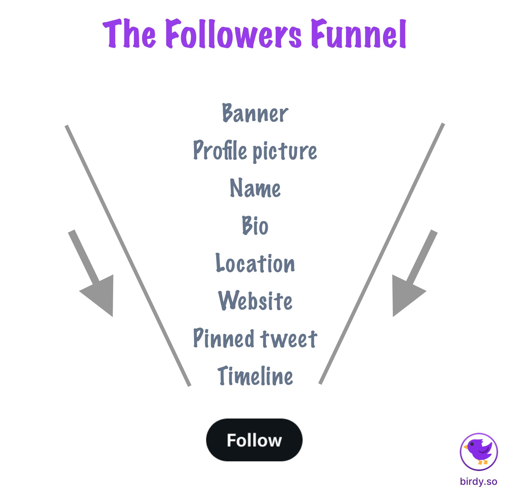
Your profile components can be categorized into three levels of exposure:
- High exposure: these components are visible everywhere you show up on Twitter - on your profile, but also in the timelines, replies, sidebar widgets, and search results.
- Medium exposure: these components are visible on your profile, but also in the search results, some of the sidebar widgets, and whenever users hover over your name or profile picture to get more details.
- Low exposure: these components are only visible on your profile.
The banner is only visible on your profile, therefore it has a low level of exposure. It doesn’t mean it is less important than the components with a higher level of exposure. As you will see, the banner plays an important part in your followers funnel.
Before we can move on from the basic stuff, here’s what you need to know in regard to the actual banner file you will need to upload:
- The file image must be a PNG, a JPEG, or a GIF
- The recommended dimensions for banners are 1500x500 pixels (3:1 aspect ratio)
The biggest visual block
Your Twitter profile banner is the most significant visual element of your profile for two reasons.
- It’s the first thing people see when they visit your profile
- It’s taking more screen real estate than any other component in your profile
I hope it is obvious why you should optimize this Twitter profile component 😁
The what
Here’s where the banner really shines: when you use it to convey stuff that can’t be conveyed via text.
For instance, if you’re an artist or designer, you can use your banner to showcase your work. If you’re an author, you can use your banner to display your book covers.
In some cases, if your work doesn’t lend itself particularly well to a visual item, a one-liner that clearly defines why you are on Twitter and why others should follow you is the way to go.
The how
There are several factors to consider to ensure that your banner is effective. First and foremost, it is crucial to use high-quality images. The banner is usually the first thing that visitors see on your profile, so you don’t want to make a bad first impression by using low-quality or pixelated images.
Additionally, it is essential to ensure that your banner matches your branding and color scheme. This will help reinforce your brand identity. It can’t be stated enough. Repetitive exposure with the same constant theme is how people recognize you on a daily basis. I haven’t changed my profile picture or banner for almost a year and neither should you (especially true for the profile picture).
Then, you should avoid cluttering your banner with too many elements. It’s really important to focus on the main message you want to convey. Less is often more when designing a banner, especially when considering mobile phones 👇
Mobile
Way more users access Twitter via mobile than via desktop. One of the biggest mistakes I see people making is having a banner that isn’t optimized for mobile - which means that 80%+ of their profile visitors will see a less-than-ideal profile banner. If your goal is to have more followers, and I assume you do since you’re reading this article, this detail cannot be ignored.
In reality, only 60% of your banner is really usable. The rest will be obstructed by the camera notch, rounded screen corners, phone OS status bar, and Twitter UI buttons. This means that you need to center everything in the 60% of the non-obstructed real estate. Add anything too close to the phone borders and it will look messy.
Some examples
Let’s start with a great example from Dobroslav Radosavljevič.
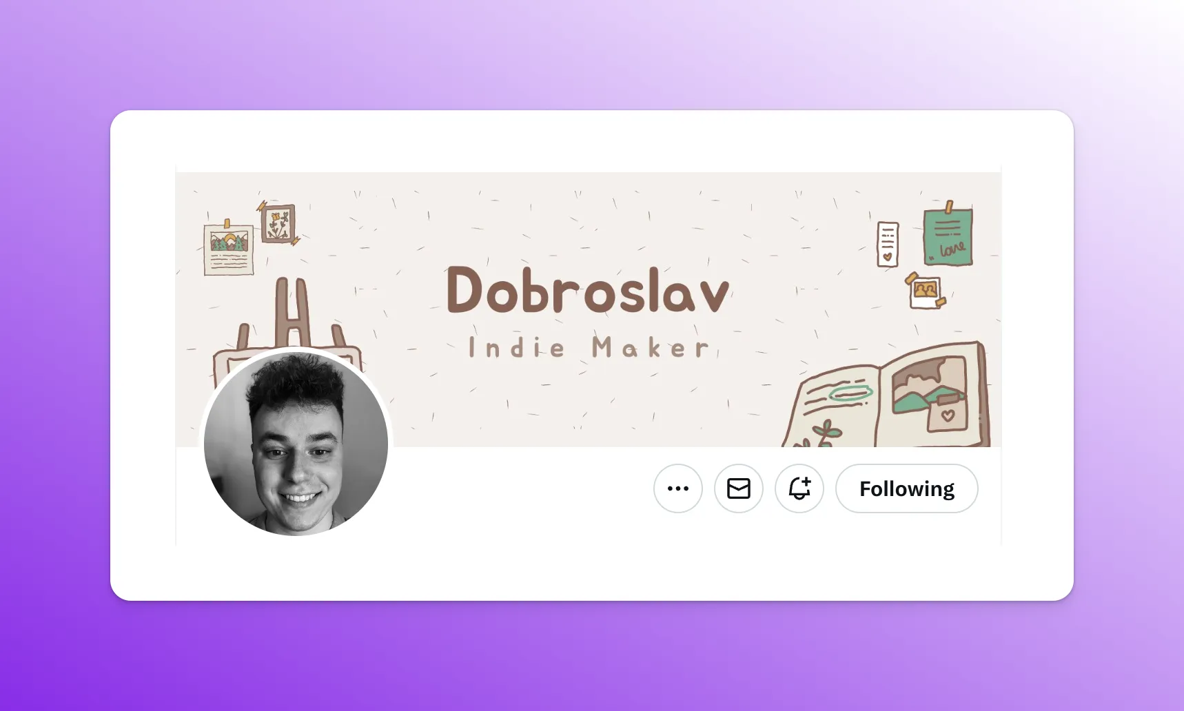
Although many elements of his banner are on the edges, thus hidden by the profile picture and obstructed on mobile, those elements are merely background elements. They are part of the background image more than they are part of the message to be conveyed, which is that Dobroslav is an indie maker and that his content will be about indie making, and appeal to other indie makers.
His banner is simple, minimalist, and uncluttered. When you look at his banner, your eyes focus directly on the centerpiece and know exactly what Dobroslav is about.
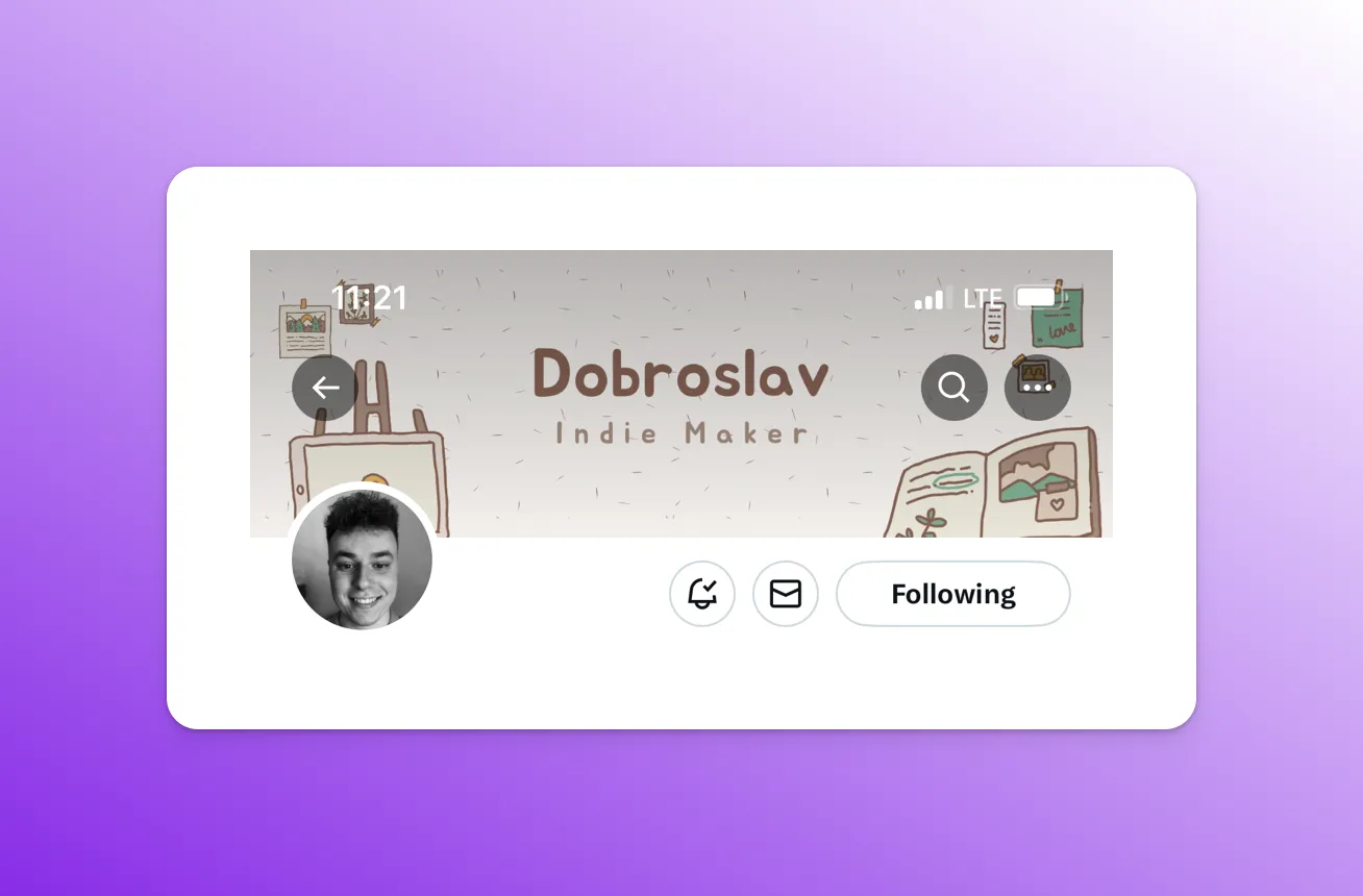
On mobile, his banner content fits perfectly into the “useful” space - that 60% of the space we talked about earlier.
Here’s a more problematic profile banner by Igor Benić:
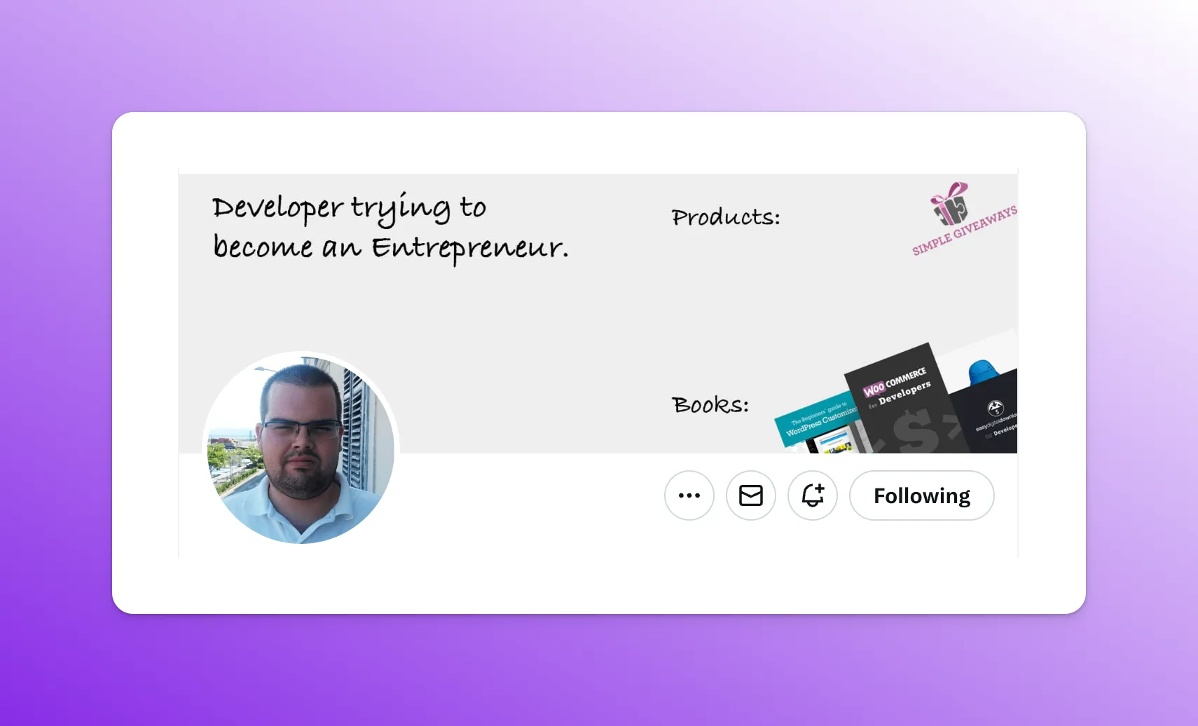
Without going into the more aesthetic and subjective aspects of the banner, everything looks decent at first glance. Igor states what he is about and what he does. But…
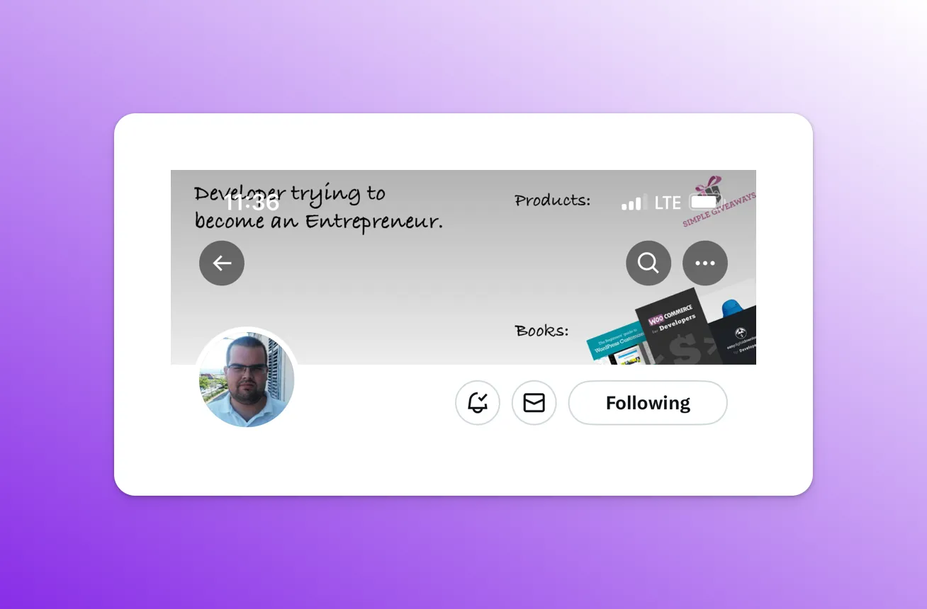
As you can see, when the banner is viewed on mobile, almost all the elements get obstructed by either the Twitter UI elements or the phone OS status bar. It looks even worse when you add the iPhone notch, which hides part of the main text on the top left.
The lesson to learn here is that you cannot add key elements on the edges of your banner.
Let’s look at another good profile banner by Daniel Nguyen!
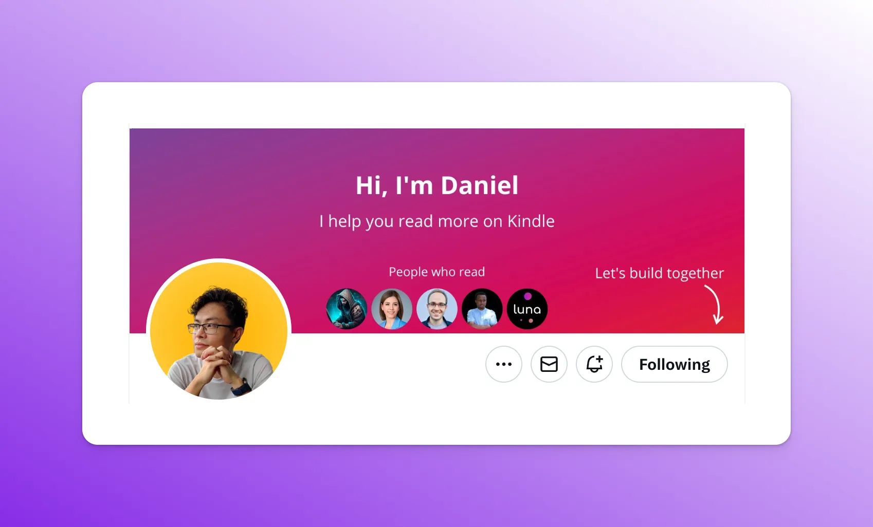
There are many good elements to analyze in this banner.
First, you can see, like a landing page (and that’s what a Twitter profile is - a personal landing page), Daniel clearly explains his value proposition. Daniel helps you read more on Kindle. This is almost like a hook, which leads the profile visitor to continue in his funnel for the explanation of how he is able to deliver on this promise.
Secondly, the bottom part of his banner is interactive. Each time Daniel gets a new follower, his banner is updated with the profile picture of his newest follower. This is a cool, additional incentive for people to follow him.
Thirdly, he even threw in a CTA in there 😁
Let’s see if it passes the test on mobile…
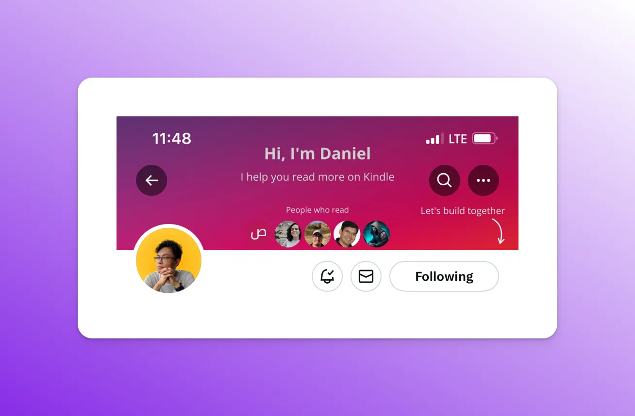
It definitely does! Each element avoid any obstruction! Even the iPhone notch fits snuggly on the background image.
Here’s Dominic Frei’s banner:
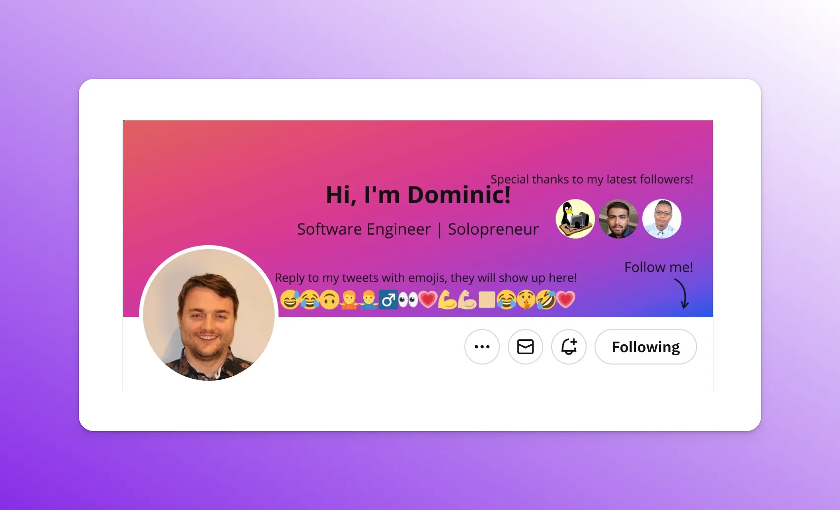
The first thing that is obvious is that it’s way too crowded. Compare this to Dobroslav’s banner, which gives a lot of space between elements and a singular focus on the main message. There are simply too many things to look at in this banner and nothing really stands out.
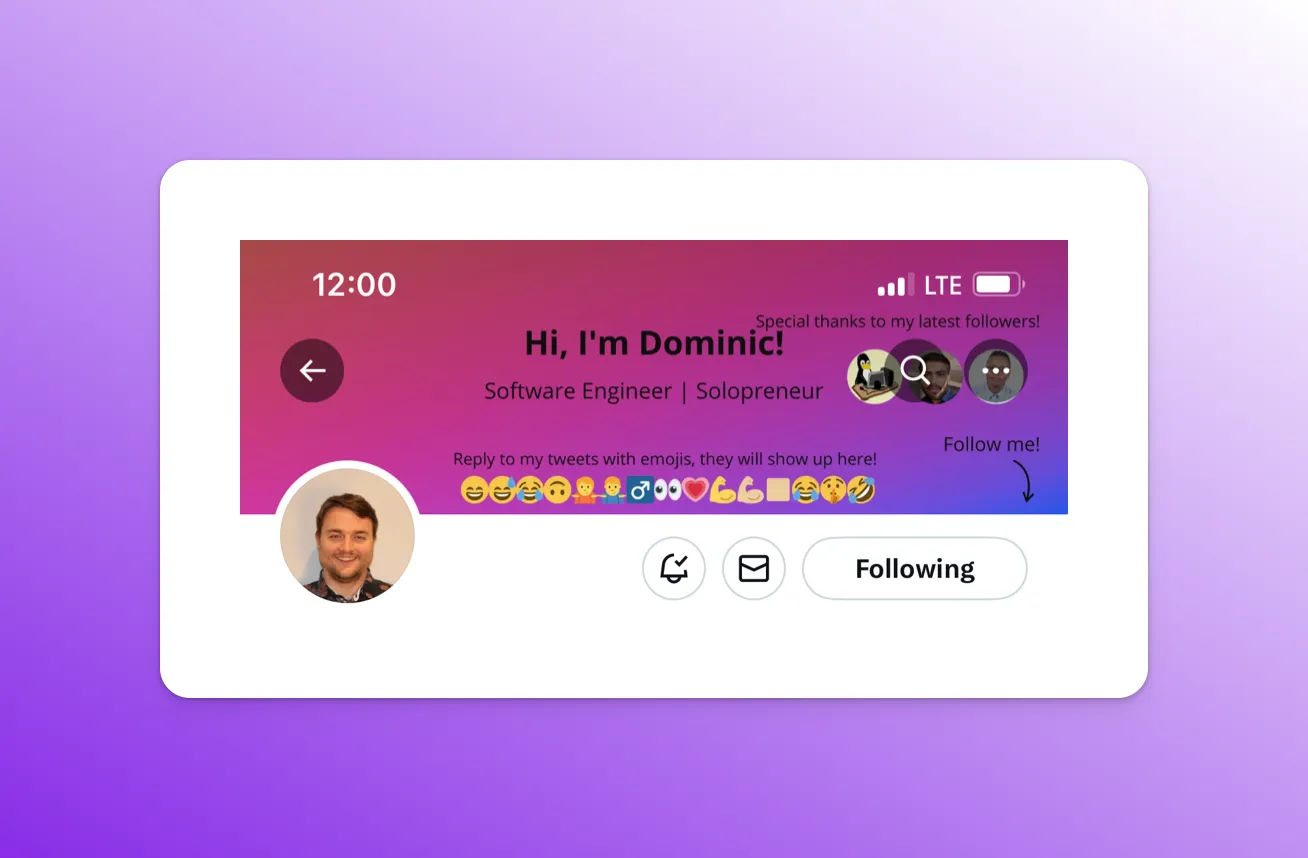
Add the mobile constraints and… this banner hurts the eyes 🥹
A final example - Luca Restagno’s banner!
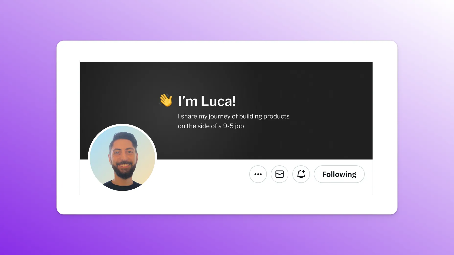
Beautiful! A warm welcome. His story in one single sentence. All the focus goes to the couple of words in the center.
And you guessed it…
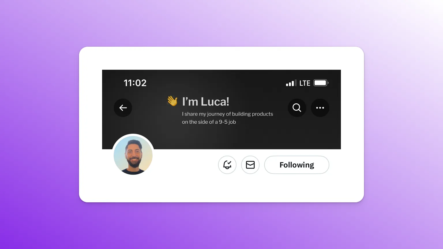
It looks great on mobile 😎
Make data-driven decisions
You now have a bunch of tips to optimize your Twitter profile. A bunch of experiments you could make. But how can you know if a change you did was truly effective? You don’t just want to be randomly changing stuff on your profile and hope for the best. You need data.
This is where Birdy comes in 😎 Birdy is a tool I created to specifically optimize your Twitter profile. It uses a technique called “A/B testing” under the hood. Create two profile versions and let Birdy determine which one converts more visitors into followers.
Try testing two different banners to see if it has an impact on your followers/visitors conversion rate 🥹 Birdy will automatically update your profile and will report back with stats in real-time.
Now on to Part 3: How to create the best Twitter profile picture where we explore the second of the profile components, the profile picture.
@maximehugodupre | Feature requests | Affiliate | Faceless Videos - zeroface.ai | TTS Vibes | Terms